138th Brakkus "Hull Breakers" (Spacenam)
-
Model: Wargames Atlantic "Spacenam" infantry
Additions: GW Cadian head, Mad Robot miniatures NVGs, green stuff sleeves
Lore
Drawn from the shattered world of Brakkus Prime, the 138th Brakkus Hull Breakers are renowned for their brutal effectiveness in close-quarters engagements. Raised amidst the labyrinthine wrecks of ancient starships, these Guardsmen are forged in the shadows of rusted hulls and choking fumes. Their homeworld’s doubled gravity has produced soldiers of tremendous physical strength, while generations of survival in the derelict void hulks have honed their ability to fight in the dark, the tight, and the airless.
-
-
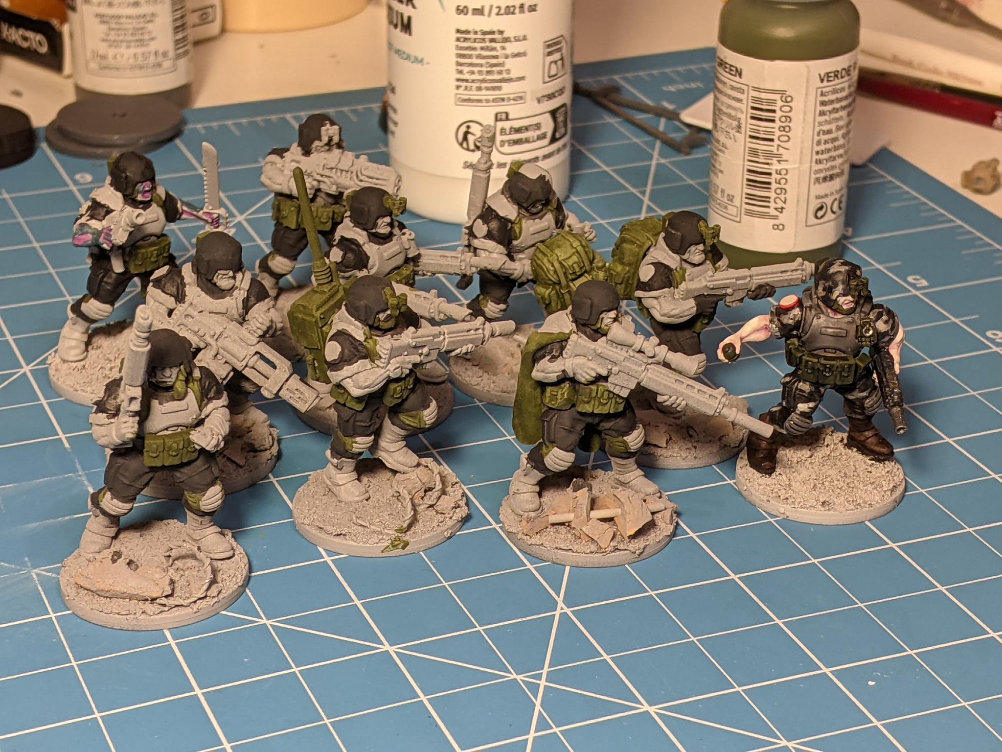
I wanted to include a small painting blog of the process I went through.
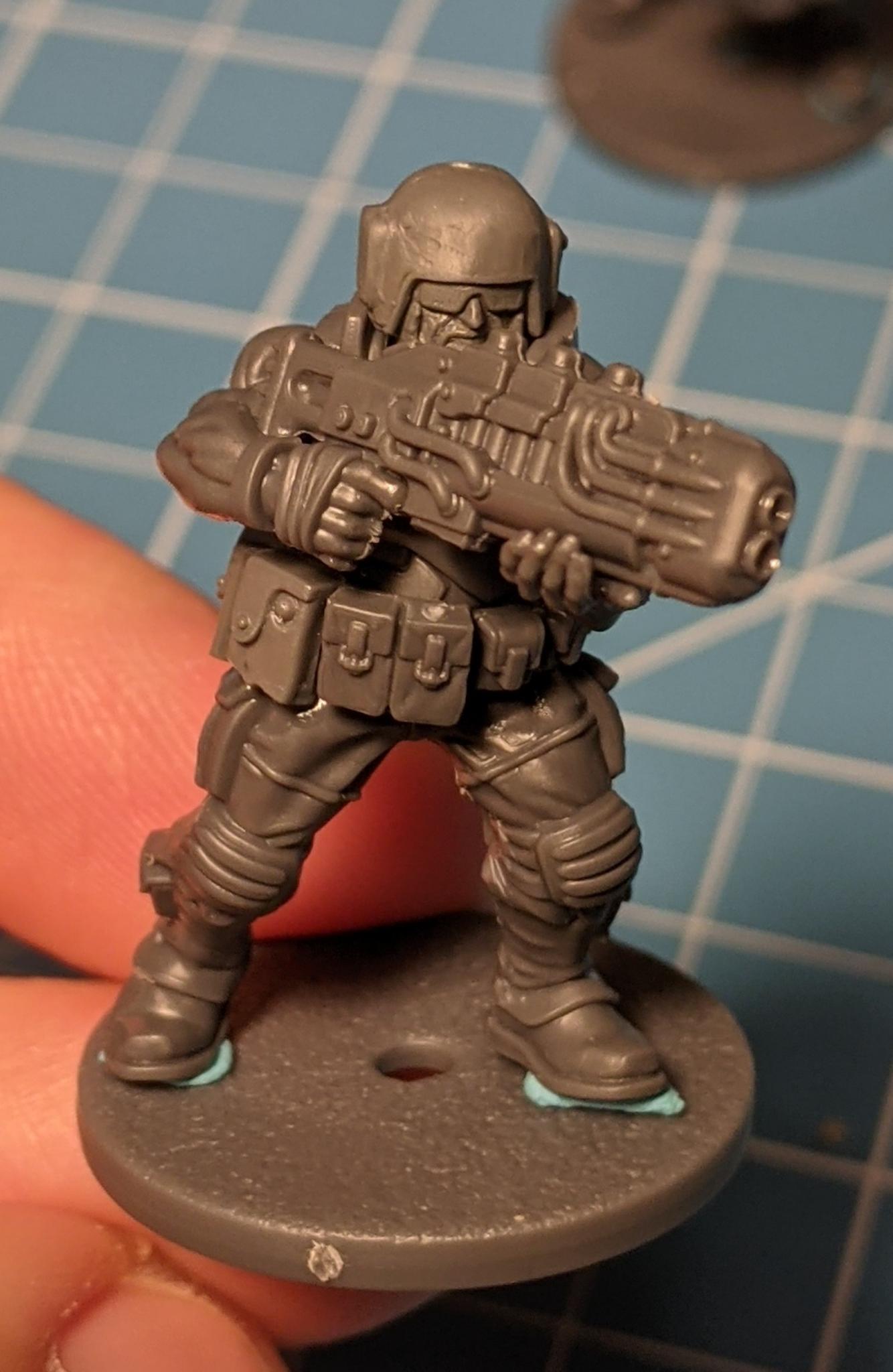
I decided the Spacenam kits really interested me so for a very reasonable price, I picked up a box and put them together. I don't play any tabletop games but I do enjoy dabbling in the lore/world of a certain UK company.
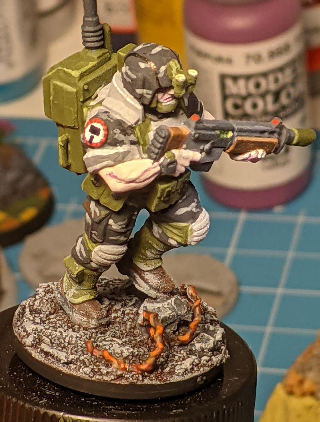
So I decided to see how an old school Cadian head would fit on these guys. After smoothing out the helmet which I thought look more realistic without the large symbol on the front.
hopefully the sunglasses will help him a bit.
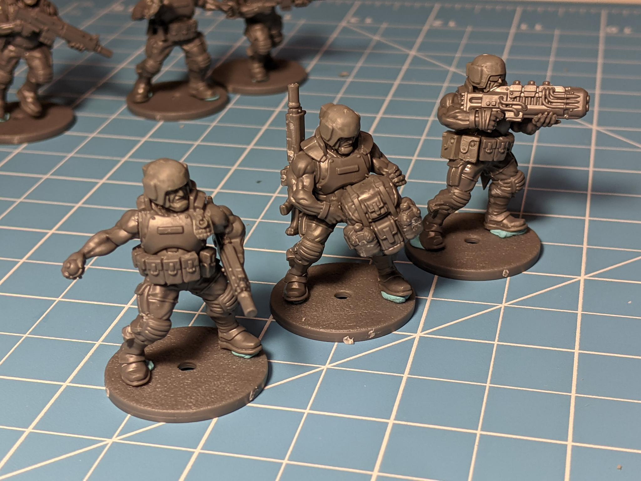
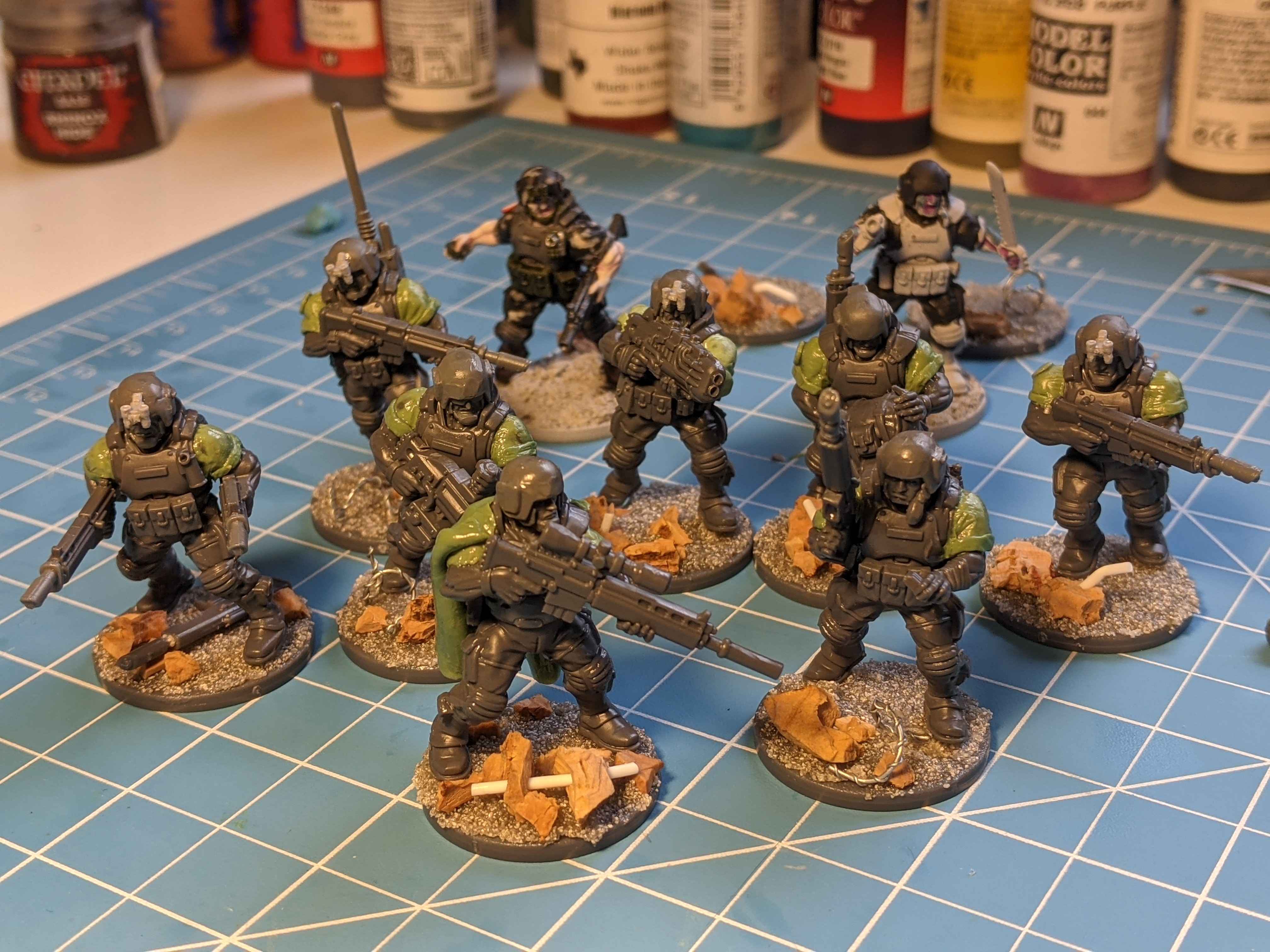
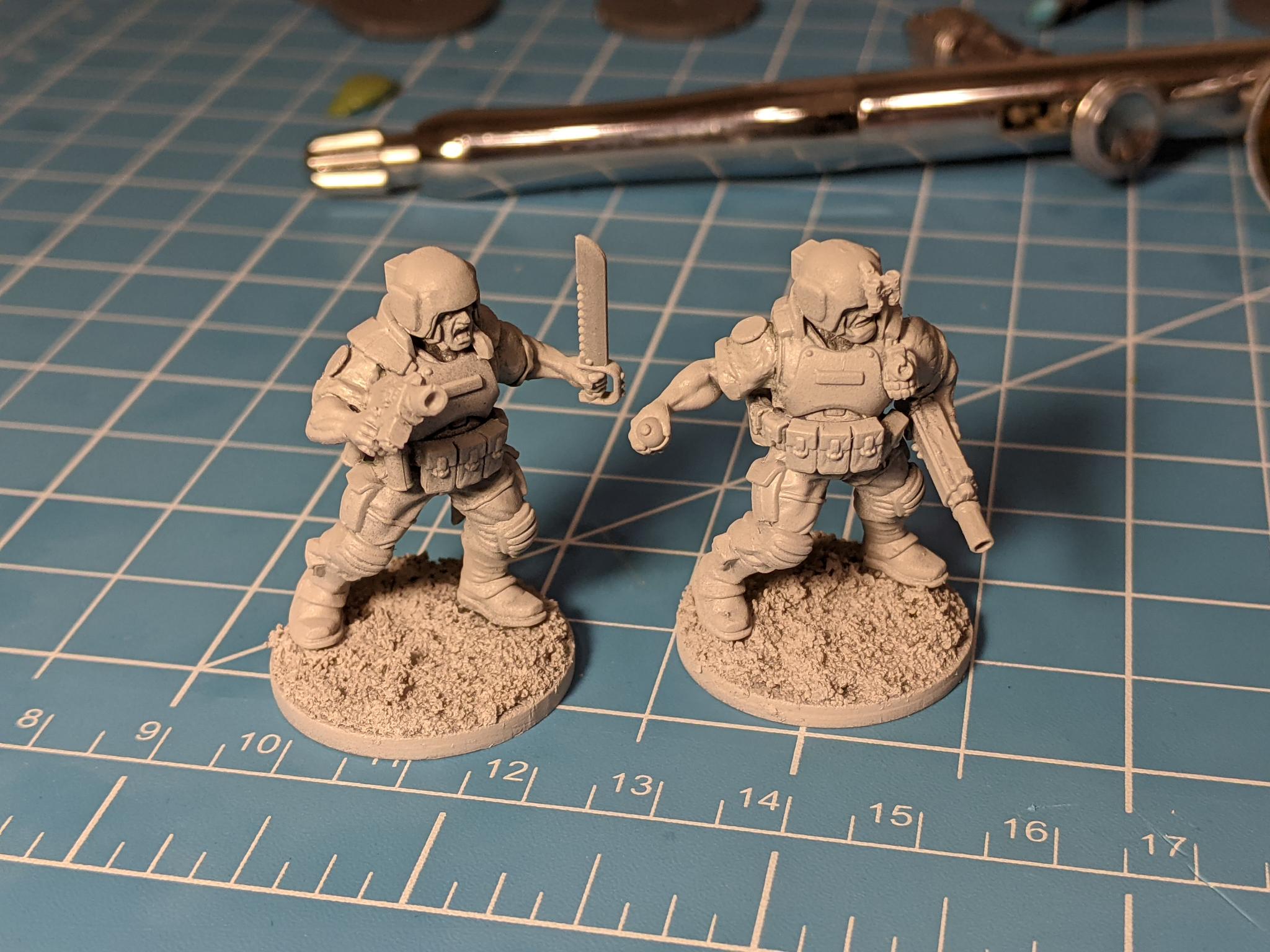
Deciding I liked the brutal industrial look. I decided to start putting a squad of 10 together. With a Sergeant, medic, and two special weapons.
I have never been a fan of the no sleeve catachans look however. So I broke out the green stuff.
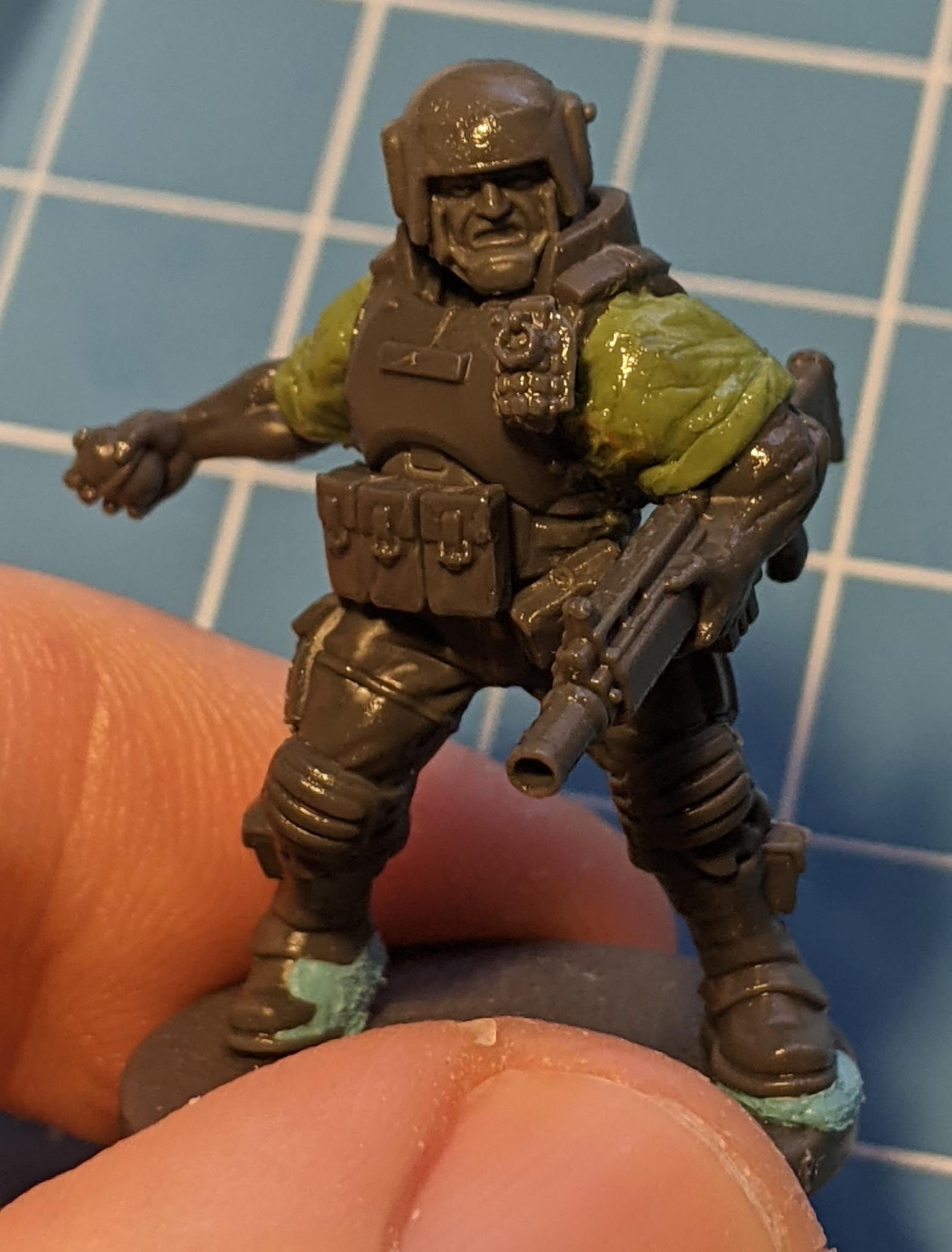
I mixed 50/50 greenstuff and milieput with the help of some soft color shapes and got a rough rolled sleeve look. Then I decided they needed unit patches.
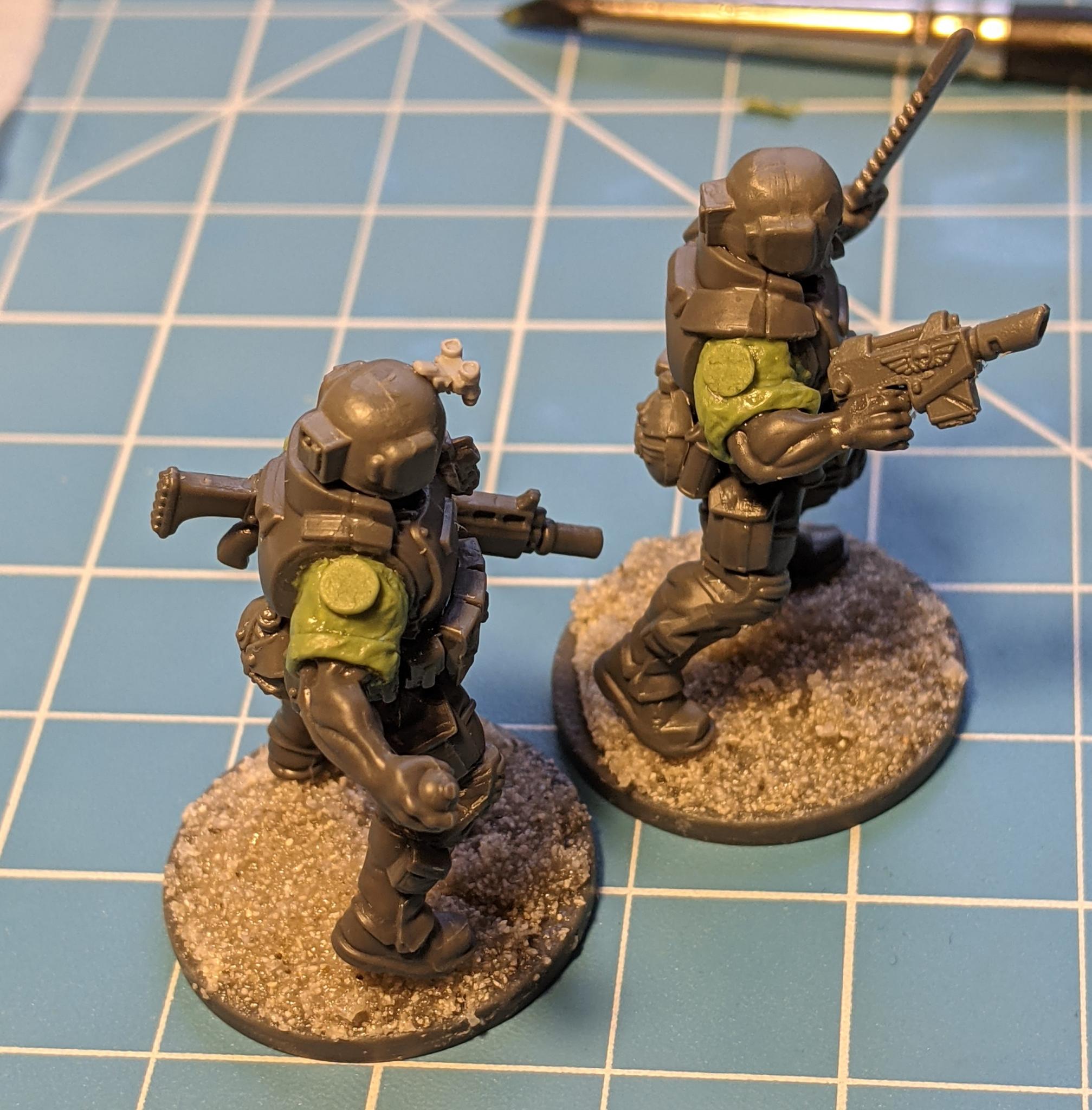
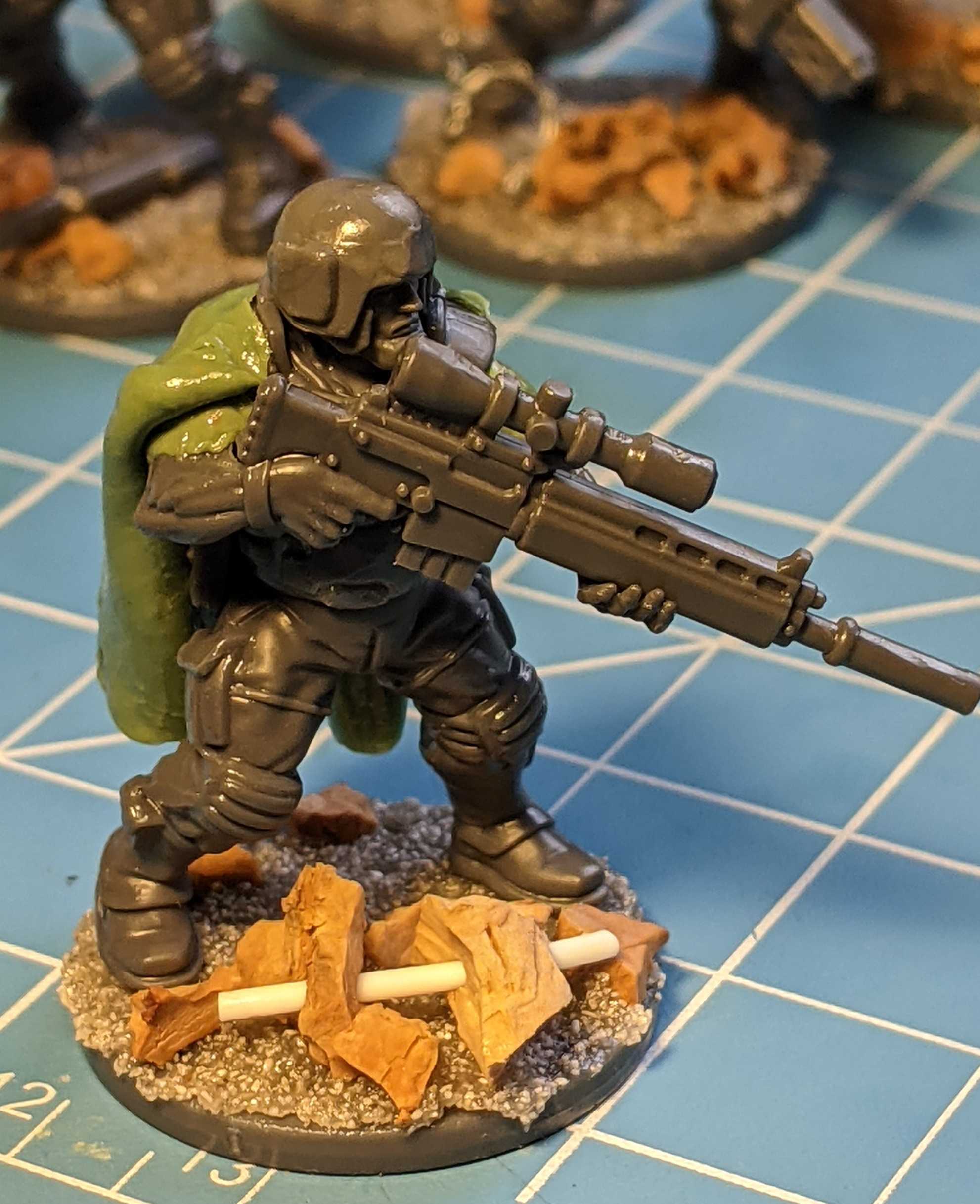
one soldier got a cape and a scope to make him a "designated marksman" or sniper. Most others got the barrels of their rifles swapped out with lasguns.
I decided to base them next and wanted to go with an churned up urban city fight. Most of the Spacenam guys looked like they were running so I wanted to give the impression they were storming across no man's land.
Next I primed them.
I wanted to implement an urban camo as the lore for these guys started to come to me. Instead of being jungle fighters like their GW inspiration, they would be from a massive ship breaking world. Chat GPT helped me fill in the background. So they would need a dark urban theme.
Then I decided to build up the urban camo.
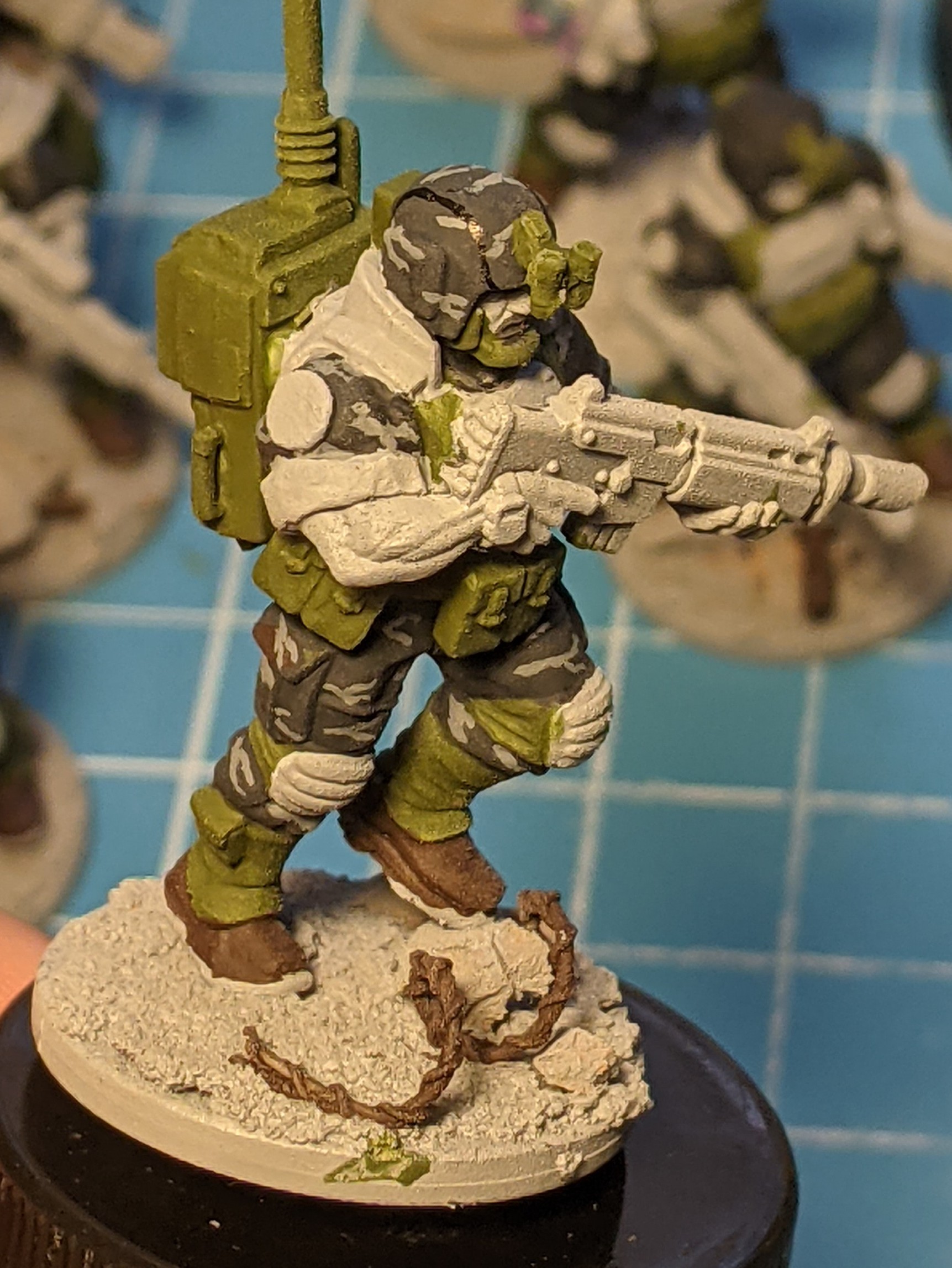
I built up some very small wavey lines and then layered it with som lighter gray. The armor would complement the camo fatigues with a very light grey.
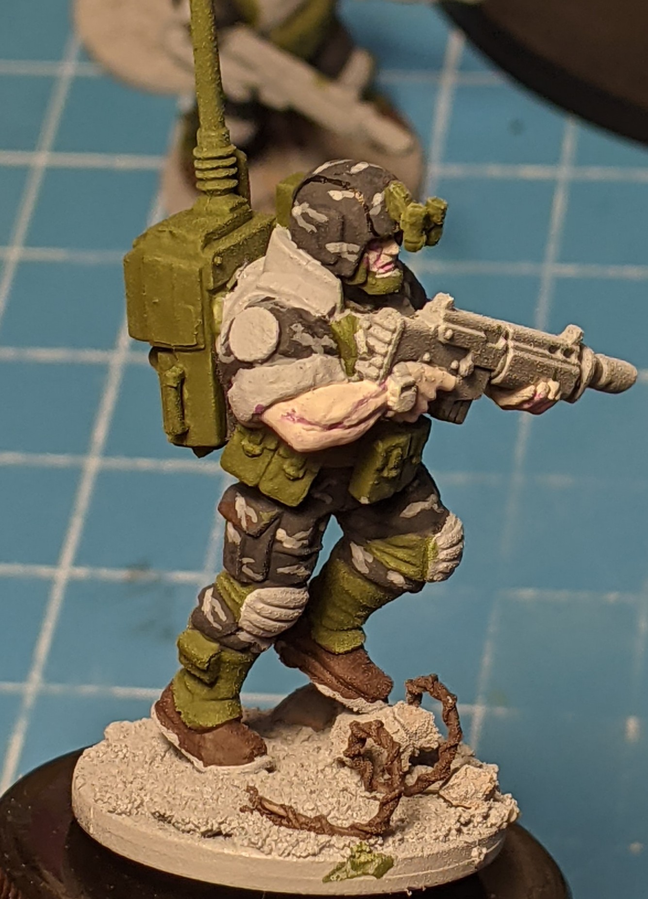
I wanted them to have a sickly pale skin tone as these guys have essentially grown up in decaying ships and be subjected to who knows what chemicals.
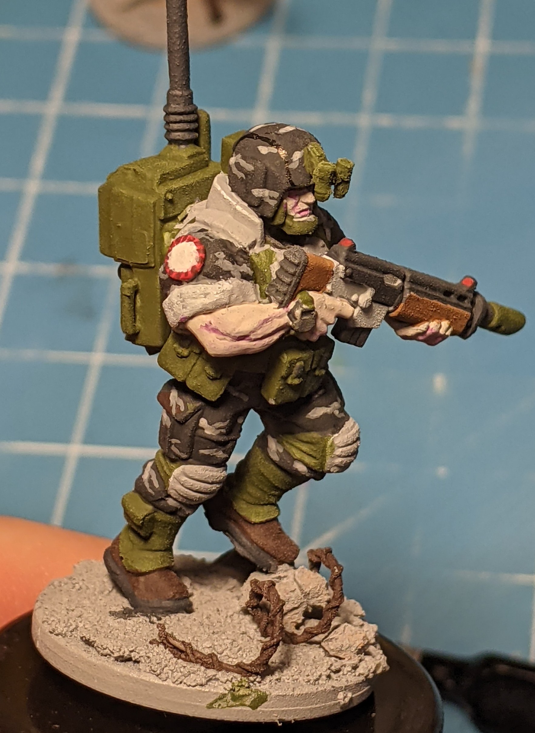
Then I built up the pouches and other details. I felt like most pouches in the munitorium stores would probably be painted a standard OD green rather than closely match their armor. Somehow it just seemed more realistic to me.
After that I brought it up to the first picture I posted. Still working through these guys as this was my second test model. I want to give him a quick varnish and an oil wash to give some more depth.
Let me know what you think!
-
@timbus the thirteenth
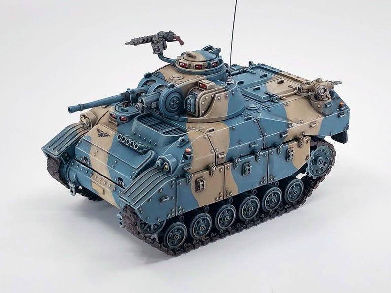
Thanks! I will probably get them a 3D printed AFV eventually.
There is a designer called Nfeyma who has a lot of cool designs.
-
-
-
-
-
